01 / The Casebook / Fintech · Bulk payments
The Salary Problem
Designing confidence into OPay’s missing bulk-transfer workflow.
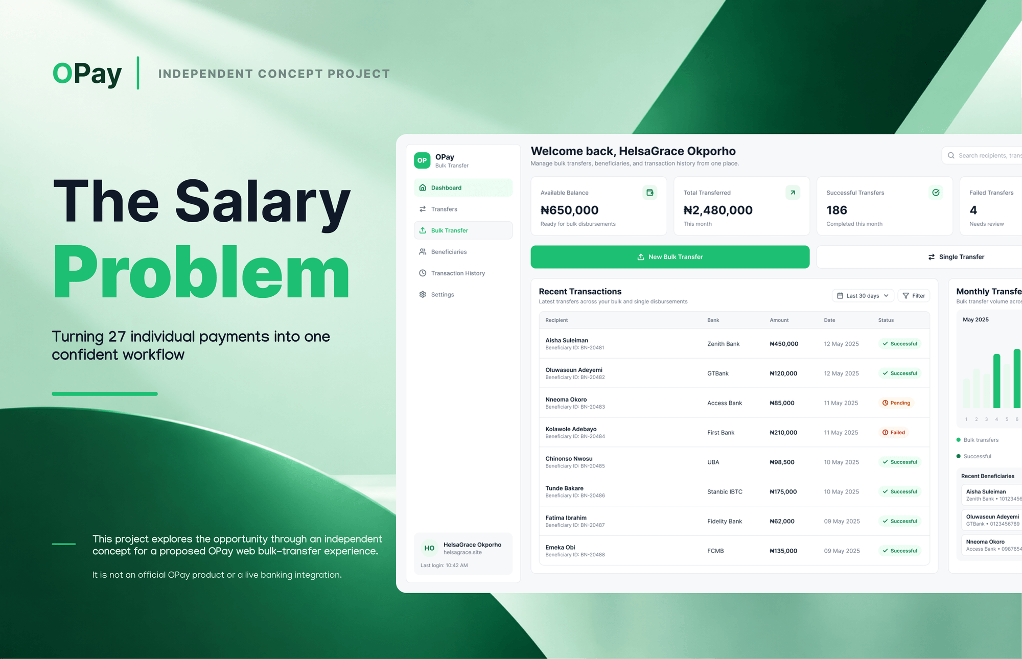
A proposed desktop workflow for OPay that turns 20–27 individual salary transfers into one reviewed, auditable batch — designed from the firsthand experience of processing monthly salaries.
- Role
- UI/UX Design · Solo
- Category
- Fintech · Bulk payments
- Status
- Concept
- Year
- 2026
01 / Context
The web workflow OPay doesn’t have yet.
OPay is mobile-first. This concept proposes the missing desktop surface for one high-stakes job: paying a month of salaries. It is a focused product design exercise, not a live banking integration.
I designed it alone over a two-day sprint in October 2026, in Figma. The problem came from my own experience as a business manager processing salaries for 20–27 people.
It is an independent, unsolicited concept. It is not affiliated with or endorsed by OPay.
- Two-day concept sprint · October 2026
- Solo — research framing, UI/UX, interface system, case study
- Figma · desktop web concept
- Independent concept — not an official OPay product
02 / The story
The problem wasn’t sending money. It was managing every payment correctly.
As a business manager, I processed monthly salaries for 20–27 people. The data lived in a Google Sheet — names, banks, account numbers, amounts — and every payment went out individually through the OPay mobile app.
The fear wasn’t abstract. It was mistyping an amount, or sending the right amount to the wrong person. I never made an error, but only because I checked every transaction three times: before entering it, before the PIN, and again on the security confirmation screen.
A salary run took 30–60 minutes depending on interruptions. Afterwards I screenshotted every receipt, renamed it to the colleague’s name and saved it to a Google Drive folder — 20–27 times. Saved beneficiaries were unreliable because colleagues changed account details mid-month, so I verified against the sheet every time. And transaction fees were invisible; I sometimes discovered I was short at the end of the month because they had quietly deducted across the run.
- No running fee total existed anywhere.
- No consolidated receipt existed.
- The process worked only because I checked every payment three times.
03 / The current state
The loop I repeated every month
The system made the transfer. The accuracy work stayed with me.
- 01
Open OPay → Transfer → Bank Transfer
- 02
Check frequent beneficiaries
- 03
Verify against the salary sheet
- 04
Type or confirm the account number
- 05
Wait for name verification and cross-check
- 06
Enter the amount and switch back to the sheet
- 07
Confirm with PIN/biometric, then re-check the security screen
- 08
Screenshot, rename and file the receipt — repeat 20–27 times
“The cognitive burden of accuracy sat entirely on me, not the system.”
04 / The opportunity
What if salary payments were managed as one batch?
The opportunity wasn’t just to transfer money faster. It was to make the entire process easier to prepare, check and follow through.
That broke into three jobs: reduce the repetitive work, support accuracy and confidence, and improve financial visibility.
04 / The opportunity
Three jobs the batch had to do
- 01
Reduce repetitive work
Make the whole process easier to prepare, check and follow through — not just faster to send.
- 02
Support accuracy and confidence
Make recipient validation and payment review distinct steps before authorisation.
- 03
Improve financial visibility and follow-through
Bring batch costs, fees and payment outcomes into a more structured workflow.
05 / The solution
From individual transfers to one structured workflow.
Instead of sending money to each person one by one, the concept brings multiple salary payments into a single guided workflow. It starts with preparing the recipient list, then moves through validation, payment review and authorisation.
The product model has five stages. The interface stepper shows three decision points — Import, Review and Authorise — with validation inside Import and results after Authorise. That keeps the visible stepper focused on the decisions that move the batch forward, while the case study below uses the fuller five-stage model.
The goal is to make important information easier to check, reduce repetitive manual work, and give users a clearer view of payment outcomes.
06 / The five stages
Import. Validate. Review. Authorise. Results.
- 01
Import
Bring recipient details into one batch.
- 02
Validate
Review missing information and recipient issues.
- 03
Review
Check payment details and the batch summary.
- 04
Authorise
Give the batch a distinct confirmation stage.
- 05
Results
Review reported outcomes and follow up.
07 / Import
Bring the batch into one place.
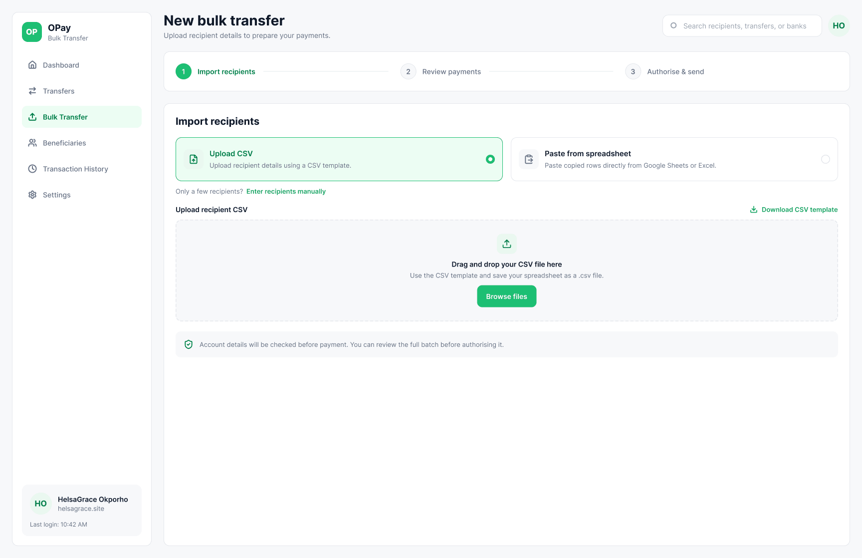
The first job is to stop retyping. Users upload a CSV, paste rows directly from Google Sheets, or enter recipients manually when the batch is small. The fields are the same ones the sheet already holds: name, bank, account number and amount.
The interface shows three visible steps — Import, Review and Authorise — while account details are checked before payment as part of validation.
- Upload a CSV or paste from Google Sheets
- Manual entry fallback for smaller batches
- Name · Bank · Account number · Amount
08 / Validate
Make recipient issues visible before authorisation.
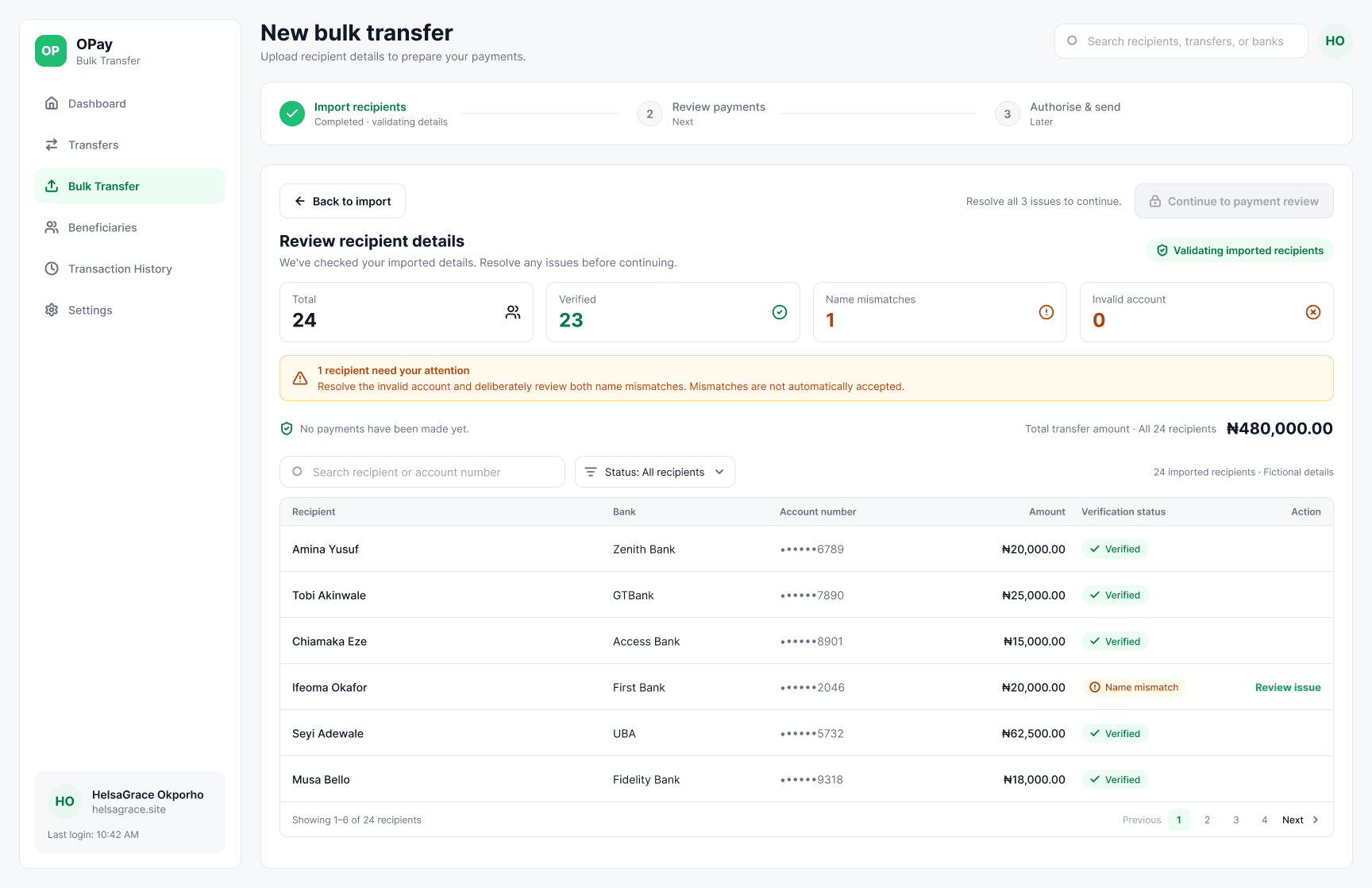
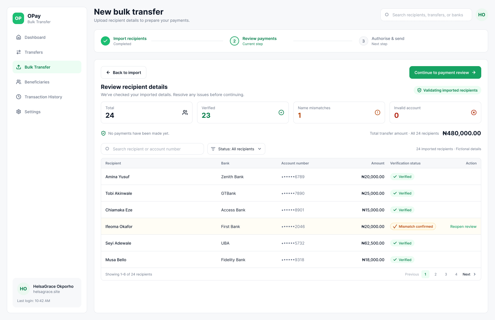
Accuracy was the biggest concern in the manual process, so validation is a distinct stage rather than a warning buried in the review table. The system verifies all accounts together and returns a table of verified, mismatched and invalid recipients.
A mismatch gets its own context: the sheet says one name, the bank resolves another. The user can confirm the resolved name or edit the recipient details without starting the batch again. Invalid accounts must be fixed before the batch can move on.
- All accounts verified together
- Mismatch → confirm or edit
- Invalid → must be fixed
- No continuation with unresolved flags
08 / Validate
Give the issue somewhere to live.
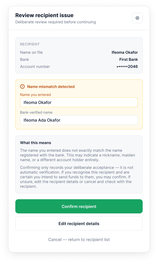
The issue drawer keeps the mismatch in context. It shows what the sheet says, what the bank resolved, and the two ways forward: confirm the resolved name or edit the saved details.
Editing happens inside the issue flow, not by sending the user back to import. The user keeps their place and the batch stays intact.
08 / Validate
Continue only when the batch is clean.
After the edit, the validation state is explicit: no invalid accounts, the mismatch resolved, and the continue action enabled. The user can see exactly what changed before moving to the money.
“A mismatch is not an error to hide. It is a decision the person needs to make before the money moves.”
09 / Review
Review the money before the commitment.
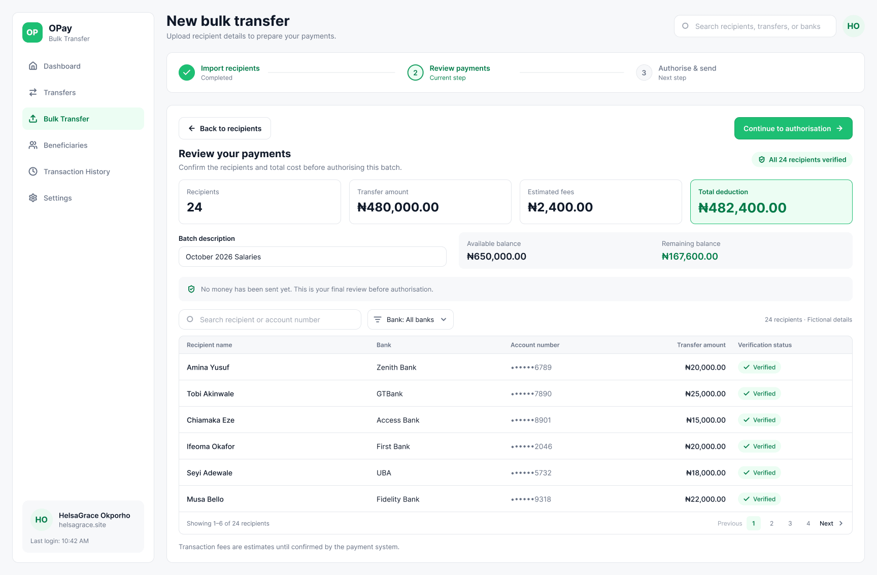
The review screen is the receipt preview. It shows the full recipient table and a summary panel: 24 recipients, ₦480,000 total transfer, ₦2,400 estimated fees, ₦482,400 total deduction, ₦650,000 available balance and ₦167,600 remaining.
The summary is the most important design moment. It brings the batch cost, fees and balance into view before the user commits. No money has been sent yet.
Review and authorise are separate steps. The review screen is where the user checks the batch; the authorise screen is where they make the commitment.
- 24 recipients · ₦480,000 transfer
- ₦2,400 estimated fees
- ₦482,400 total deduction
- No money sent yet
10 / Authorise
Make the decision point deliberate.
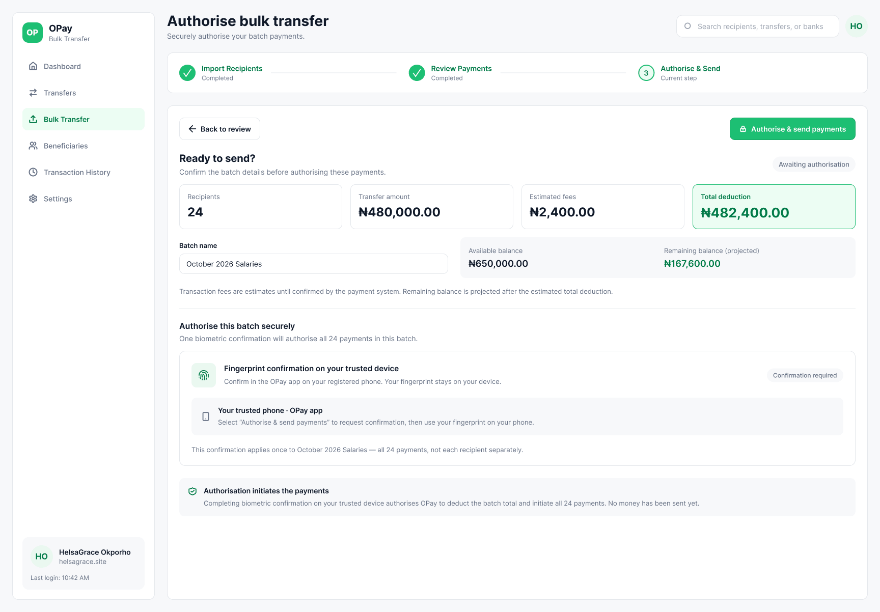
The concept replaces 20–27 individual confirmations with one security moment. A single biometric confirmation on a trusted device authorises the whole batch after the user has seen the batch summary.
That is the design bet: not fewer checks, but better-placed checks. The user sees the whole batch before committing instead of re-verifying each payment in isolation.
The design does not prove that errors are eliminated or that the proposed flow is safer in production.
- One biometric confirmation for the whole batch
- Batch summary visible before authorisation
- No money sent until confirmation
11 / Results
Sending is not the end of the task.
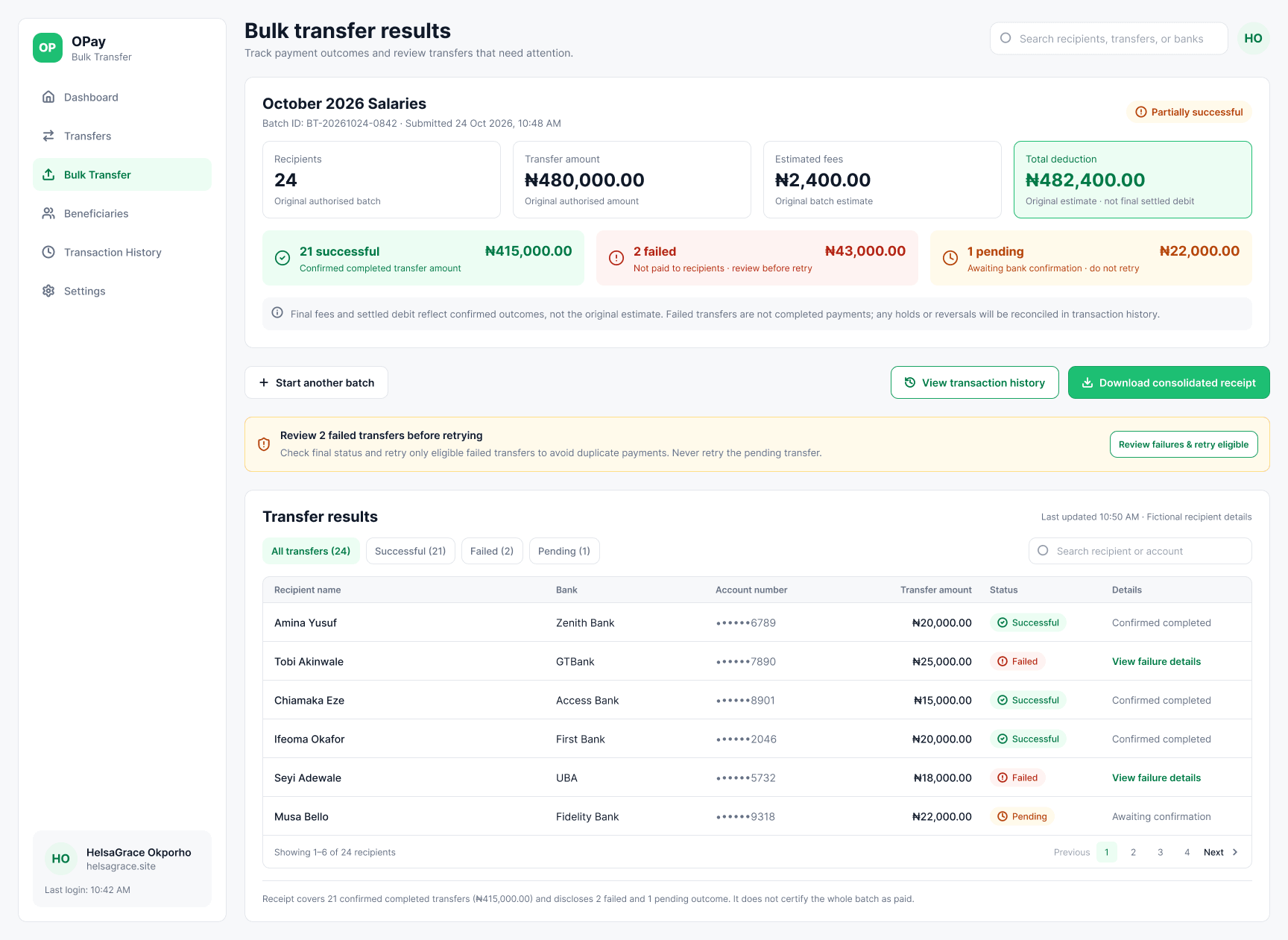
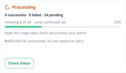
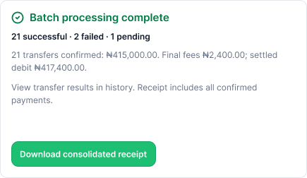
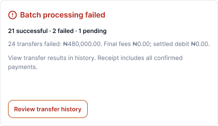
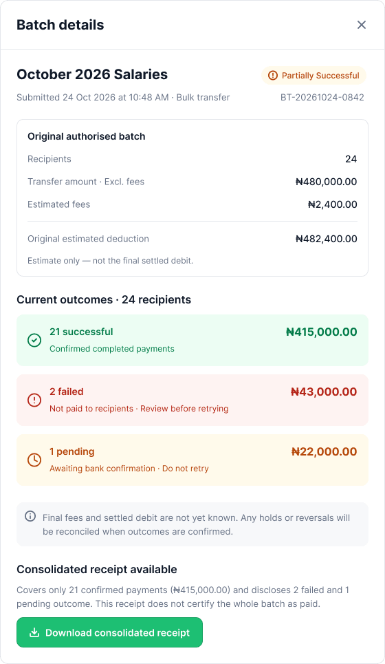
The results screen carries the batch after authorisation: 21 successful, 2 failed and 1 pending in the example. The user sees the total deduction, each recipient’s status and the batch details.
The design separates outcomes that look similar but are not. A pending transfer is not a failure: it may still settle, so retrying it could create a duplicate payment. The retry rule is deliberately narrow — retry only failed transfers, never pending ones.
The original process ended with a manual receipt routine. The concept ends with a batch record: a consolidated receipt covering only confirmed payments, with failed and pending outcomes still visible.
- 21 successful · 2 failed · 1 pending
- Retry only failed transfers
- Never retry pending
- Consolidated receipt for confirmed payments
11 / Results
Three batch states
12 / Supporting workflow
Support the wider workflow.
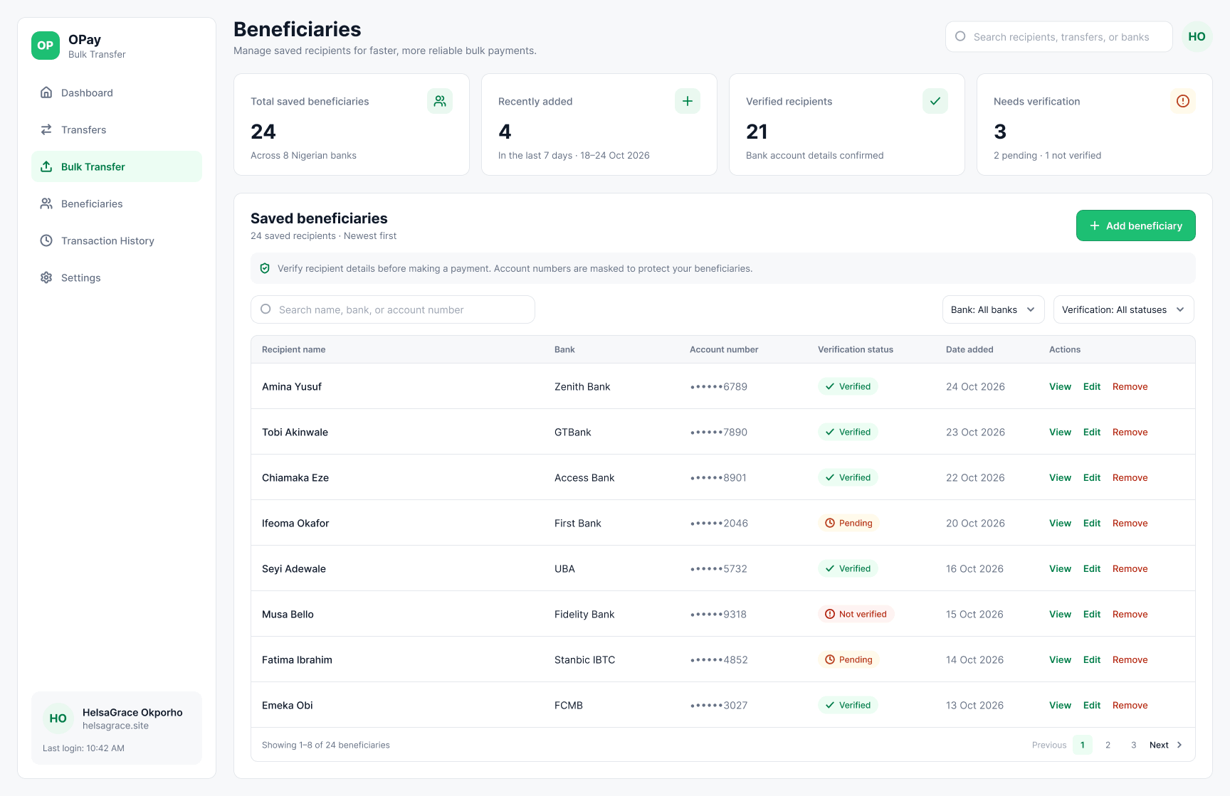
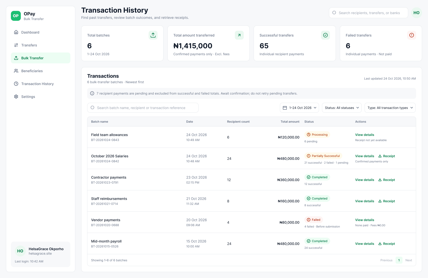
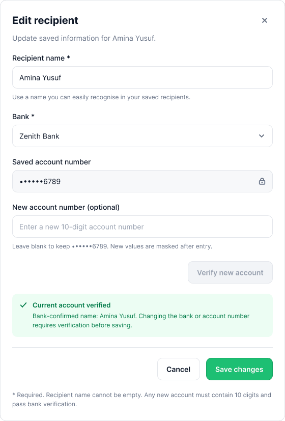
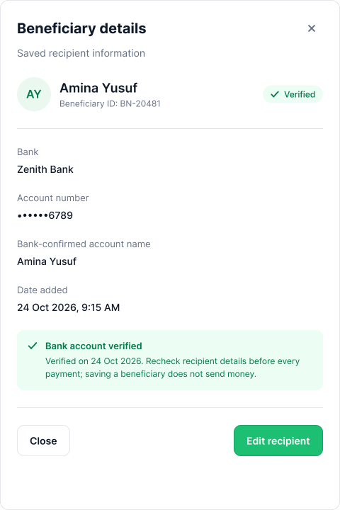
Recurring salary runs involve more than the transfer. People change banks and account numbers, and the next run starts with the same recipients. Beneficiaries and transaction history are therefore part of the concept, not separate admin features.
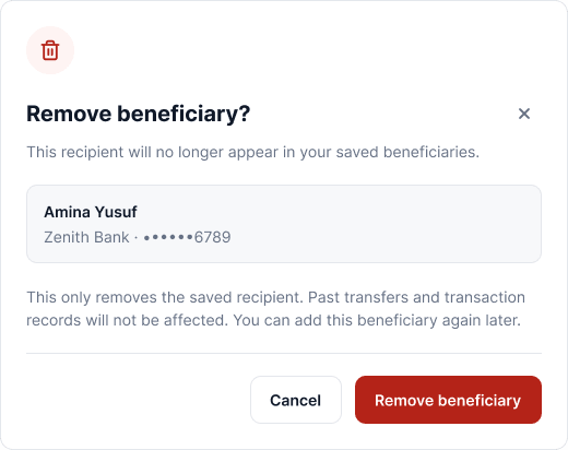
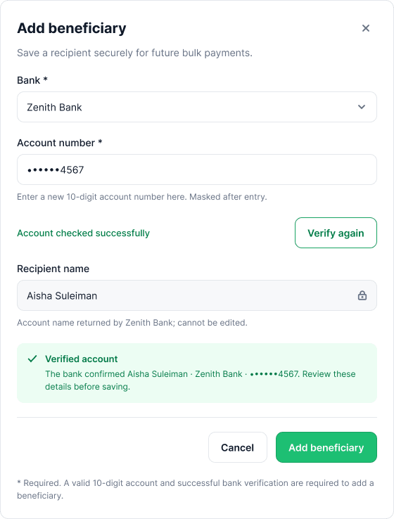
Beneficiaries carry verification status and can be added, edited or removed; changing a bank or account number requires re-verification. Transaction history keeps past batches, their statuses and their receipts together.
- Verified recipients and needs-verification states
- Add, edit or remove a beneficiary
- Changing bank or account details requires re-verification
- Batch history with statuses and receipts
12 / Supporting workflow
The records behind a recurring run
13 / Scope notes
What was considered, not visualised.
The written scope also included insufficient balance and the low-balance warning, session timeout, a first-time empty state and saved templates. Those states are not represented as final screens in this case study, so I have not presented them as designed interfaces.
- Insufficient balance / low-balance warning — the review summary shows the balance after the batch, but the amber threshold state is not in the final screens.
- Session timeout, first-time empty state and saved templates — considered in the scope, not visualised.
- Mobile — deliberately out of scope because OPay is mobile-first; this concept proposes the web workflow it doesn't have yet.
- Live bank verification, payment execution and production security — out of scope for the concept.
14 / Interface system
OPay Mobile, promoted.
The visual direction keeps OPay’s brand DNA but gives it more breathing room and enough density for business operations. Inter throughout, a fixed sidebar, border-bottom tables, and white cards with 12px radius and 24px padding.
OPay Green
#1DBF73
Primary brand
Green Dark
#17A362
Hover / active
Background
#F7F8FA
App canvas
Surface
#FFFFFF
Cards / panels
Border
#E4E7EC
Dividers / inputs
Body text
#101928
Primary text
Secondary text
#667185
Labels / body
Warning
#F79009
Low balance / attention
Error
#D92D20
Invalid / failed
Info
#1570EF
Processing / information
Typography
Inter
Inter
Page title 24 / Section heading 18 / Table header 13 / Body 14 / Metadata 12.
Components
- Inputs48px height · 8px radius · green focus ring
- Buttons44px minimum height · 8px radius · solid green primary
- TablesBorder-bottom rows only · no zebra striping
- Status chipsVerified · Mismatch · Invalid
- CardsWhite · 1px border · 12px radius · 24px padding
- Sidebar240px · active item with green left bar
15 / Reflection
What this concept explores and what it doesn’t prove.
The prototype demonstrates a connected product concept: a proposed desktop journey linking recipient import, validation, payment review, authorisation, status views, beneficiary management and transaction history. The interactive Figma prototype communicates the intended flow and interface behaviour.
The concept has not been tested with external users and does not include live payment execution, bank verification or production security infrastructure. No measured time savings, reduction in errors or financial outcomes are claimed.
What the prototype demonstrates
A connected product concept covering the full batch journey, from recipient data to a consolidated receipt.
What remains unvalidated
Real-world effectiveness. This is a design concept, not a live banking integration or a tested product.
16 / What I’d do next
Validate the workflow with people who manage multiple payments.
The next step is not more screens. It is testing whether the proposed workflow addresses needs beyond my own experience.
- Test comprehension — can users import recipient data and understand validation feedback without help?
- Test financial clarity — can users interpret the batch summary, fees and balance before authorising?
- Test status and recovery — do users understand processing, completion and issues, and know what to do next?
17 / Proposed measurement
How I’d measure it.
These are proposed measures, not results.
- Time to prepare and authorise a batch, compared with the manual workflow.
- Recipient issues caught before authorisation; unresolved issues that reach review.
- Retry errors, duplicate-payment attempts and unresolved pending transfers.
- User confidence before authorising, and clarity after a partial failure.
“One payment. Twenty-seven people. One more deliberate way to manage the work.”
18 / Closing
A recurring task, redesigned as a product.
This project began with a recurring task I knew well. I used that experience to explore a structured product workflow that makes preparation, checking and follow-through part of the same journey.
Independent concept by HelsaGrace Okporho — not affiliated with or endorsed by OPay. Names, account numbers and amounts in the screens are illustrative.